In this article we will learn how to create time series plot in R using ggplot2 package.
Theory
Are you familiar or new to working with time series data?
It is a series of data points, each tied to some “time” which can be year, month, week, day, time.
Time series type of data is common in industrial processes (machine output per day), KPIs (average ratings per month), or governmental metrics (GDP per year).
An interesting feature of this data, is that it often tells meaningful insights on either processes or metrics it measures. It helps identify possible trends and/or seasonalities, and more.
Therefore, the first step to get even a base level of overview of the data, it is often a good idea to plot the time series data and see there is anything obvious we can identify.
Now, it’s time to create time series plot in R!
Below I will show an example of the usage of a popular R visualization package ggplot2.
Application
Below are the steps we are going to take to make sure we do master the skill of creating time series plot in R:
- Installing ggplot2 package
- Loading sample dataset: economics
- Creating a time series plot in R
Part 1. Installing ggplot2 package
As R doesn’t have this command built in, we will need an additional package in order to create a time series plot in R.
You can learn more about ggplot2 package here.
In order to install and “call” the package into your workspace, you should use the following code:
install.packages("ggplot2")
library(ggplot2)
Part 2. Loading sample dataset: economics
R has a variety datasets already built into it. Although the step of “loading” this dataset isn’t required, it’s a good practice to get familiar with 🙂
I prefer to call the data I work with “mydata”, so here is the command you would use for that:
mydata<-economics
This built-in dataset is the US economic time series.
Note: in this article I create my own datasets. If you have your own in a csv or excel files, you can follow the same procedure to arrive at the result.
Take a look at the dataset and the variables it contains:
View(mydata)
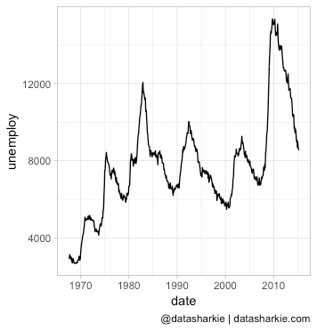
The variable we will be plotting in this tutorial is "unemploy", which is the number of unemployed (in thousands).
Part 3. Creating a time series plot in R
Our goal here is to visualize the data in the column of our choice.
Let's set up the graph theme first (this step isn't necessary, it's my personal preference for the aesthetics purposes).
theme_set(theme_light())
If you are interested, ggplot2 package has a variety of themes to choose from.
Now we are all set to create a time series plot in R.
Use the following code to arrive at our time series graph:
ggplot(mydata, aes(x=date)) +
geom_line(aes(y=unemploy))
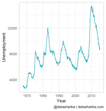
Now let's add a little colouring and change the names of the axis to look it more appealing:
ggplot(mydata, aes(x=date)) +
geom_line(aes(y=unemploy), color = "#00AFBB") +
labs(y="Unemployment", x="Year")
If you are interested to learn more about data visualization in R, you can find more articles here.